1 / 4
专业品牌视觉识别系统提案
DDheepanratnam原创
发布者:RadishonUpload the client logo as the primary reference image.
Create a premium agency-grade brand identity system poster for [BRAND NAME], [CATEGORY].
Use the uploaded logo as the only source of brand DNA. Extract its geometry, color, proportions, rhythm, personality, edge quality, contrast, visual weight, and emotional tone. Build every asset from those ingredients. Do not imitate famous brands, Behance projects, or existing identities. Use top-tier agency case studies only as a quality benchmark.
The final image should feel like a complete client-ready brand identity presentation board: dense, refined, expensive, coherent, and strategically designed.
Poster composition:
A vertical multi-column editorial grid with layered hierarchy, premium spacing, realistic mockups, sharp art direction, and no wasted space. Use 30-50 distinct visual elements. Balance large hero mockups with smaller system details. Make the uploaded logo visible as the origin point of the entire system.
Include these sections:
1. Brand Brief Panel
Show a compact client brief with very short readable text only:
- Brand name
- Brand promise, maximum 6 words
- Audience capsule, 3-5 words
- Personality triad, e.g. precise / warm / future-facing
- Category and positioning cue
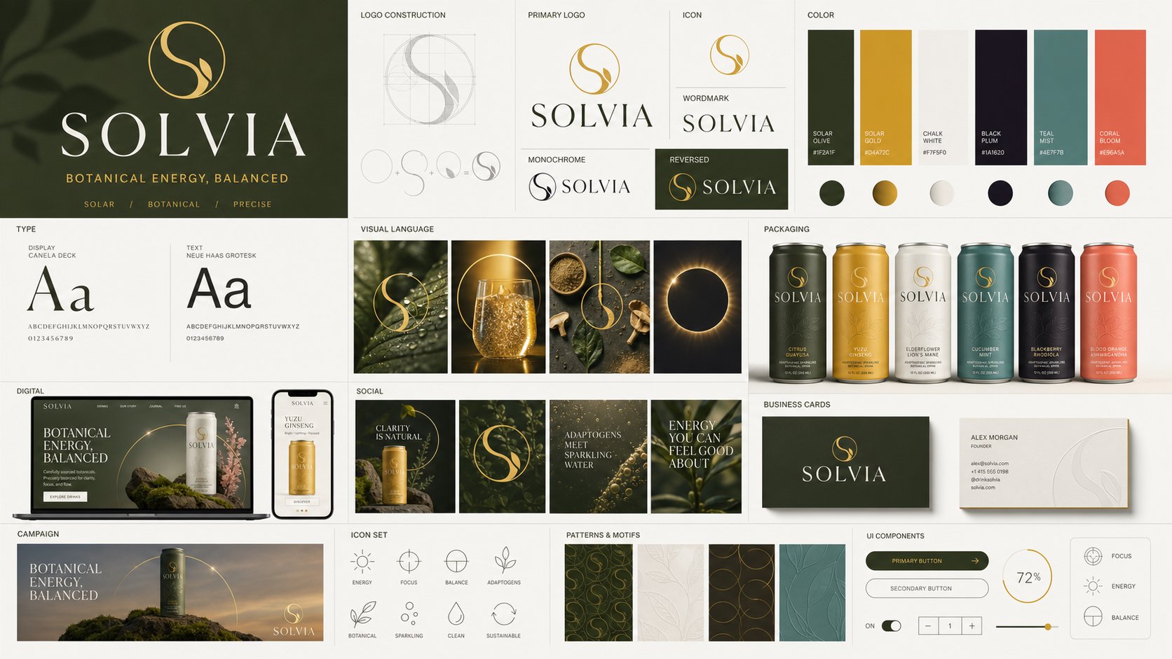
2. Logo Concept System
Show the logo as an agency concept presentation:
- Primary logo
- Icon mark
- Wordmark lockup
- Monochrome version
- Reversed version
- Clear-space guide
- Construction grid
- Logo geometry callouts derived from the uploaded logo
3. Color System
Create a professional palette extracted from the logo:
- 3-5 primary colors
- 3-5 supporting tonal extensions
- 1-2 accent colors only if they naturally come from the logo
Show wide swatches, simple role labels, light/dark usage, gradients, and color pairings.
Keep text minimal and clean. Avoid tiny unreadable HEX clutter unless it can be rendered clearly.
4. Typography System
Design a type voice that matches the logo:
- Headline type specimen
- Subheadline type specimen
- Body text texture sample
- Numerals and punctuation sample
The hierarchy must be obvious instantly. Do not use generic type; match the logo's energy.
5. Visual Language
Create 3-5 mood/art-direction tiles:
- Photography style
- Lighting direction
- Texture and material mood
- Shape language
- Cropping style
Each tile must feel like it belongs to the same brand world.
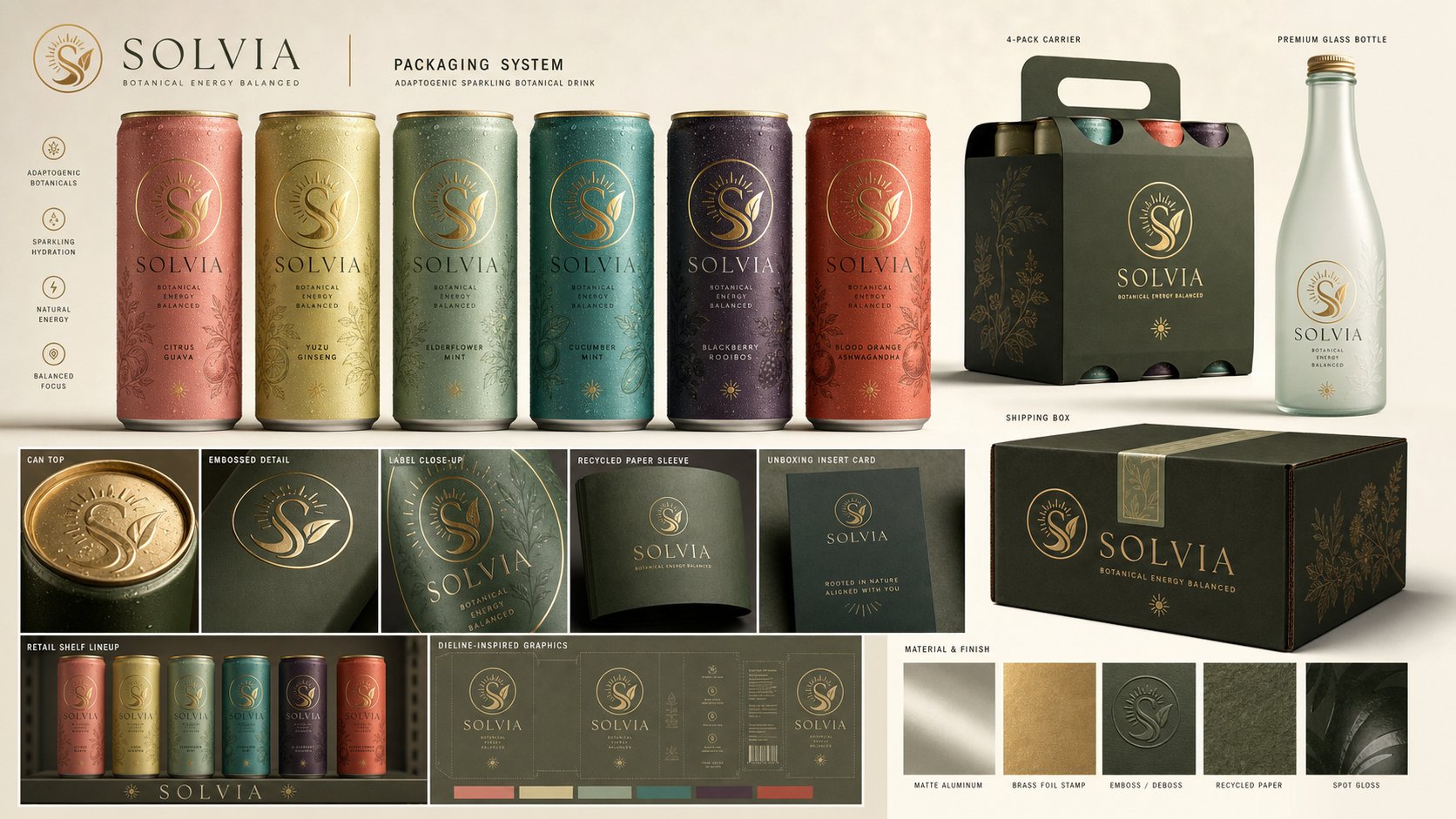
6. Packaging Design System
Create realistic dimensional packaging concepts appropriate to the category:
- Primary product package
- Secondary box or sleeve
- Label system
- Unboxing insert
- Shipping box or retail carton
- Material finish: matte, gloss, foil, paper grain, glass, metal, fabric, or plastic as brand-appropriate
The packaging must look shelf-ready and commercially viable.
7. Advertising And Campaign
Show a campaign system:
- Hero poster
- Billboard or transit panel
- Magazine or print ad
- Product photography layout
- Short campaign line, maximum 5 words
The campaign should extend the brand idea, not just place the logo on images.
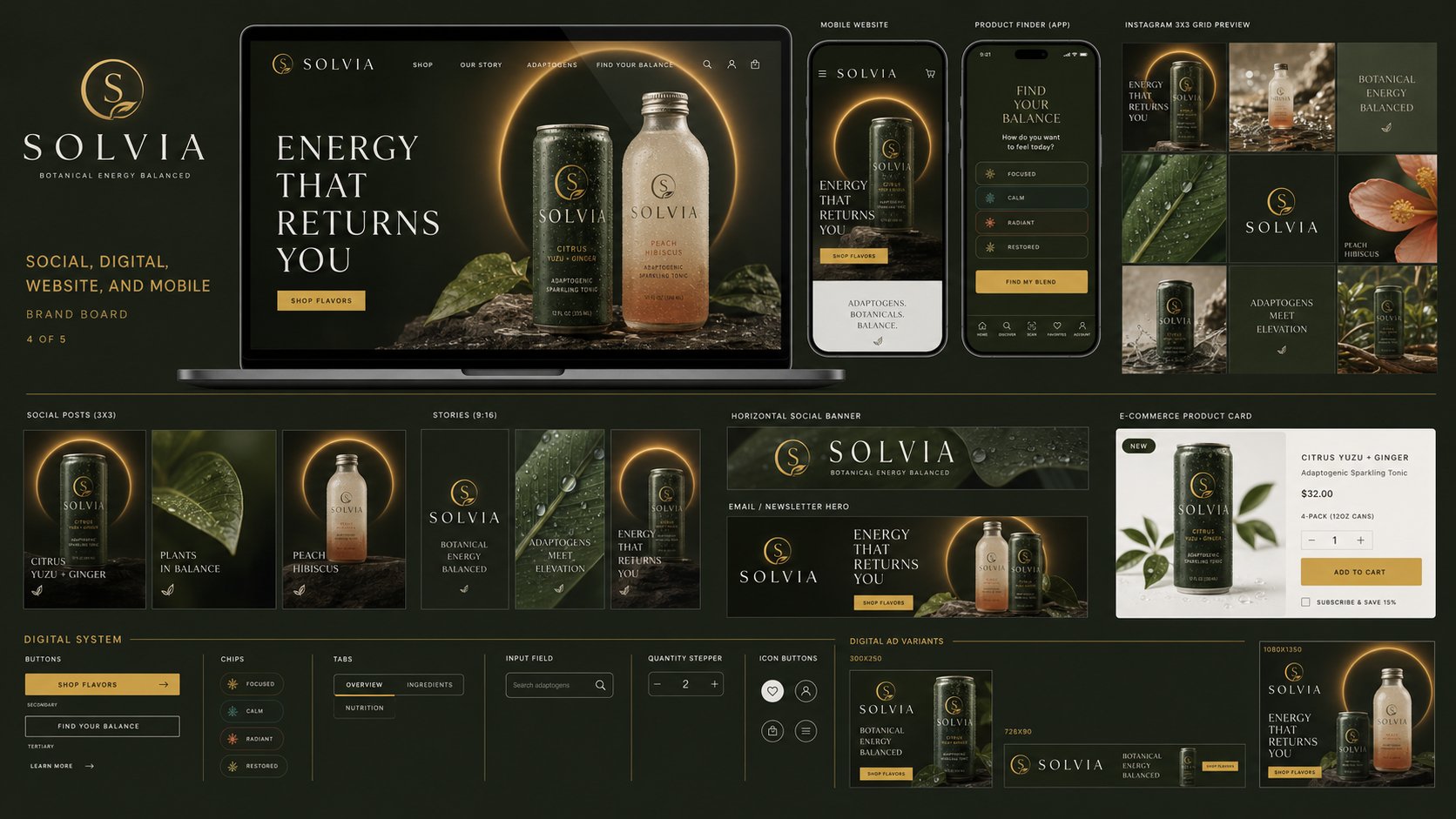
8. Social And Digital
Show digital brand applications:
- Instagram square post
- Story format
- Social banner
- Website hero screen
- Mobile app or landing screen
- Email/newsletter header
All layouts must share the same visual rules.
9. Branded Accessories
Show premium branded collateral:
- Business card front and back
- Tote bag
- Notebook
- Sticker sheet
- Lanyard or badge
- Product tag or thank-you card
- Branded tape or wrapping paper
10. Staff Uniforms And Environment
Show the brand in the physical world:
- Staff uniform or apron
- Cap or jacket
- Retail sign
- Shelf display or POS stand
- Vehicle, kiosk, or event booth if relevant
Keep the uniform tasteful and commercially realistic.
11. Design System Handoff
Show a compact UI/design-system area:
- Buttons: default, hover, disabled
- Cards
- Inputs
- Navigation bar
- Icon set, 6-10 icons
- Spacing/grid sample
Icons must use the same geometry, stroke weight, corner logic, and rhythm as the logo.
12. Patterns And Motifs
Generate patterns only from the logo geometry:
- Repeating motif
- Background texture
- Structural dividers
- Cropping frames
- Motion-like still artifacts
Nothing decorative for decoration's sake. Every motif must feel discovered from the logo.
Rendering standard:
Make the whole board look like a $15,000 agency deliverable: Behance-front-page quality, premium mockup realism, polished shadows, precise alignment, strong hierarchy, consistent art direction, and high-end material detail.
Text rules:
Use readable text only for brand name, short labels, and short campaign lines. Avoid paragraphs. No lorem ipsum. No misspellings. If small body copy is needed, render it as clean typographic texture rather than fake readable text.
Avoid:
generic templates, unrelated colors, disconnected mockups, random stock imagery, copied famous-brand aesthetics, overcrowded illegible text, flat logo-slapping, empty areas, inconsistent lighting, inconsistent materials, and unfinished sections.