1 / 4
透视排版海报设计
MMrLarus原创
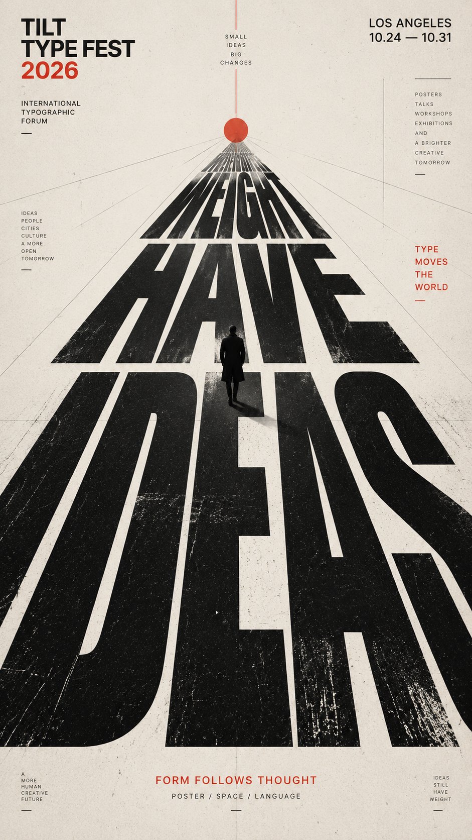
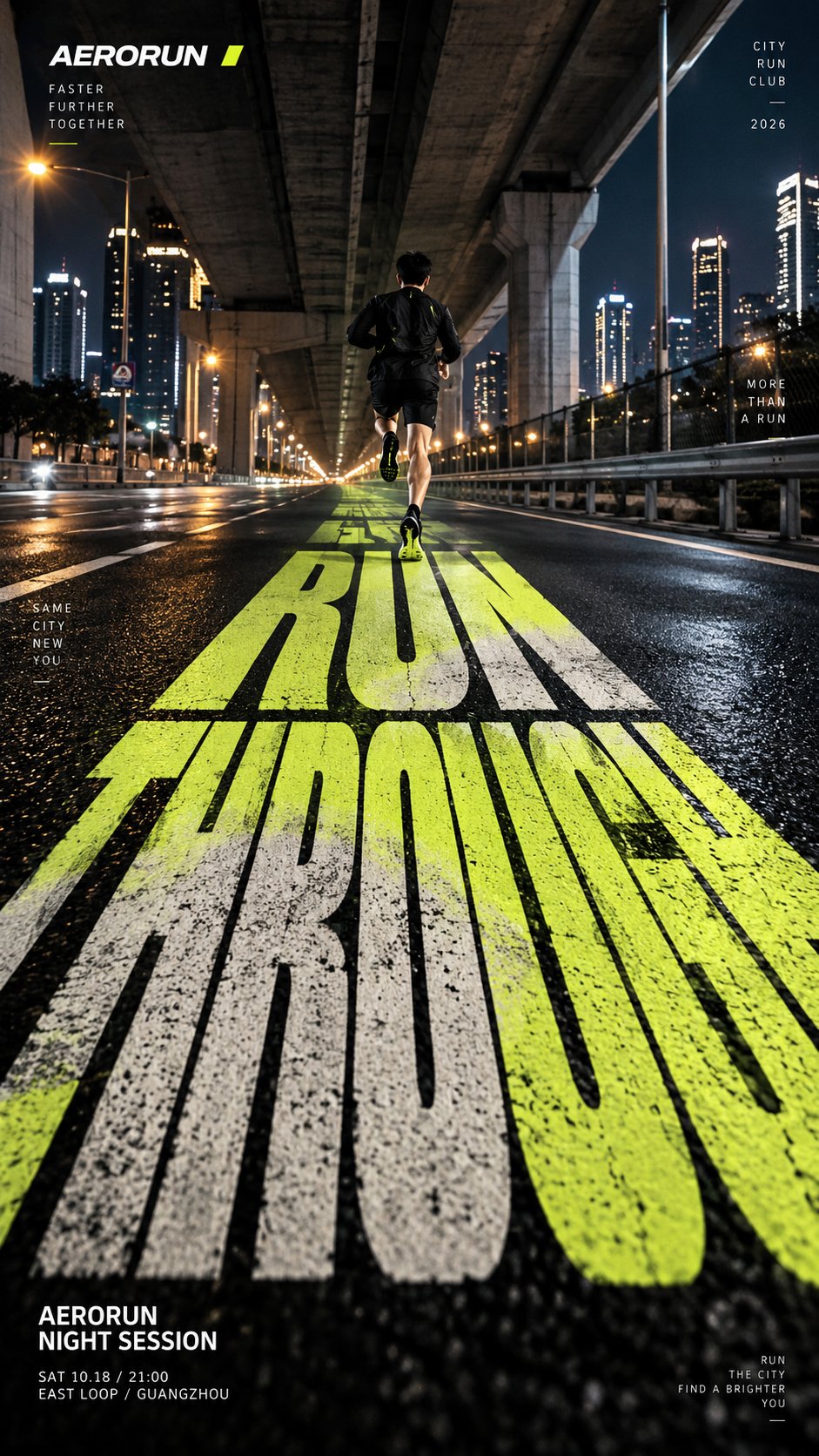
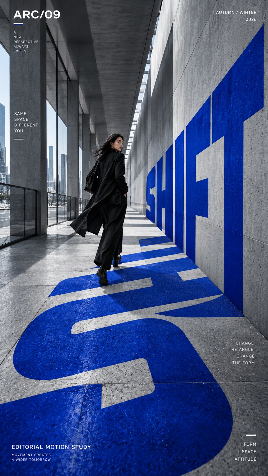
发布者:RadishonTITLE: [e.g. RUN THROUGH / SHIFT / ASCEND / IDEAS HAVE WEIGHT]
PROJECT NAME: [brand / campaign / editorial / exhibition]
SCENE: [city road / architectural corridor / concrete stairs / abstract typographic space]
SUBJECT: [runner / fashion figure / climber / small human figure / none]
PERSPECTIVE TYPE: [road depth / folded surface / stepped perspective / type-built space]
MAIN COLOR: [one strong accent color]
SUPPORTING TEXT: [location / date / short tagline]
FORMAT: 9:16 vertical poster
Create a high-impact perspective typography poster where oversized type becomes the main spatial structure of the image.
The composition should be built around one clear perspective system. Let the main word stretch, compress, fold or recede into space depending on the scene, so the typography feels physically integrated into the environment rather than placed on top of it.
Use the title as the dominant visual element, occupying roughly 35–60% of the composition. The letterforms should feel bold, clean and highly legible, while also creating strong depth and directional movement.
If the scene is a road, let the word extend along the ground toward a vanishing point.
If the scene is an architectural corridor, let the typography continue across floor and wall planes.
If the scene is stairs, let the letters break naturally across the steps while still reading clearly from the chosen viewpoint.
If the scene is abstract typographic space, let the word itself construct the spatial perspective.
If a person is included, keep them secondary and use them as a scale anchor. They should interact naturally with the typographic space by running through it, walking across it, climbing it, or standing within it.
Use a restrained palette with one strong accent color and a clean editorial layout. Add only a small amount of secondary information such as project name, date, location and one short thematic line.
Overall style: perspective typography, oversized type, editorial poster design, architectural composition, strong depth, clean hierarchy, bold visual impact.
Avoid floating text, weak perspective, random distortion, decorative 3D effects, excessive filler copy, cluttered backgrounds, watermarks and numbering.
标题:[例如 RUN THROUGH / SHIFT / ASCEND / IDEAS HAVE WEIGHT]
项目名称:[品牌 / 活动 / 编辑 / 展览]
场景:[城市道路 / 建筑走廊 / 混凝土楼梯 / 抽象字体空间]
主体:[跑步者 / 时尚人物 / 攀爬者 / 小人物 / 无]
透视类型:[道路纵深 / 折叠表面 / 阶梯透视 / 字体建构空间]
主色调:[一个强调色]
辅助文字:[地点 / 日期 / 短标语]
格式:9:16 竖版海报
创建一张高冲击力的透视字体海报,使超大字体成为图像的主要空间结构。
构图应围绕一个清晰的透视系统构建。让主文字根据场景延伸、压缩、折叠或退入空间,使字体感觉物理性地融入环境而非叠加其上。
将标题作为主导视觉元素,占据画面约 35–60% 的空间。字形应感觉粗犷、干净且高度可读,同时创造强烈的纵深感和方向性动势。
如果场景是道路,让文字沿地面延伸向消失点。
如果场景是建筑走廊,让字体在地面和墙面之间延续。
如果场景是楼梯,让字母自然地跨越台阶断裂,同时从所选视角仍能清晰阅读。
如果场景是抽象字体空间,让文字本身建构空间透视。
如果包含人物,将其置于次要位置,用作比例锚点。他们应自然地与字体空间互动——跑过其中、走过其中、攀爬其中或站立其中。
使用克制的配色方案,一个强烈强调色配合简洁的编辑布局。仅添加少量次要信息,如项目名称、日期、地点和一条简短的主题语线。
整体风格:透视字体、超大字体、编辑海报设计、建筑构图、强烈纵深、清晰层级、大胆视觉冲击。
避免漂浮文字、软弱透视、随机变形、装饰性 3D 效果、过多填充文字、杂乱背景、水印和编号。