1 / 4
高调季节性编辑海报设计
xxiaoxiaodong01原创
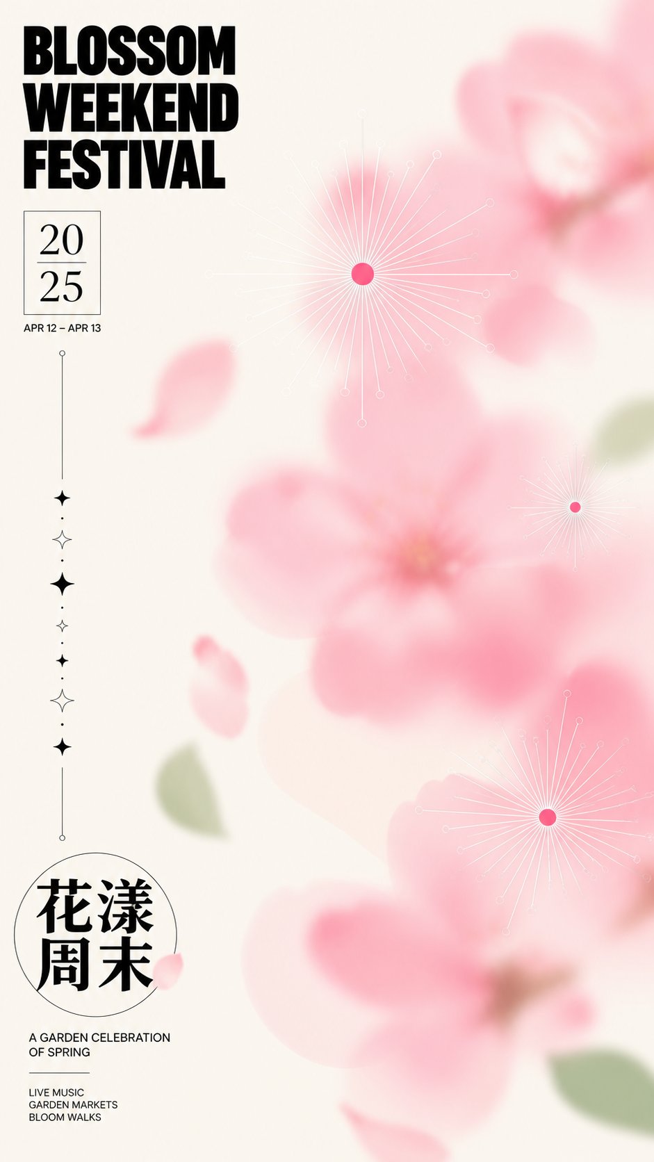
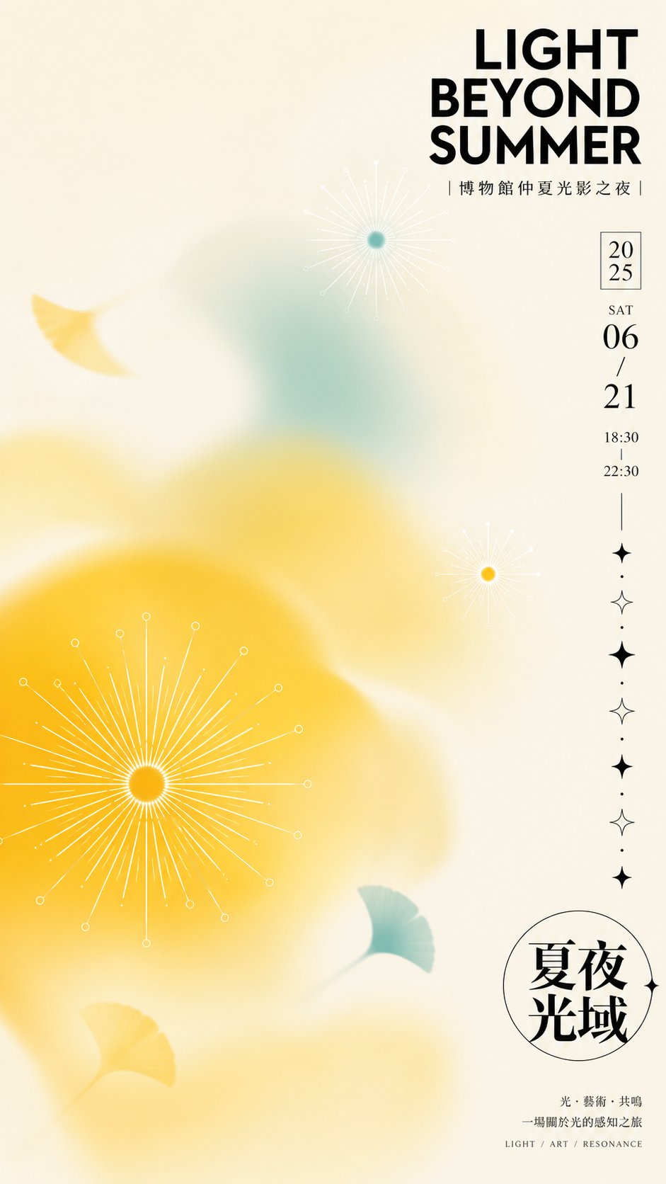
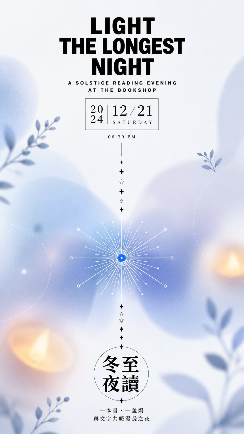
发布者:RadishonBuild a fresh, high-key seasonal editorial poster around any thematic subject, letting the reading begin with a dense black title at one starting corner and flow downward through a narrow year-and-date module, thin elongated guide lines, and a continuous run of small symbols before arriving at a circular theme badge near the bottom of the same side; keep most of the composition as quiet negative space, while graphic forms on the middle and opposite side create an unevenly spaced diagonal loop, with a few elements cropped at the edges so the image feels as though it continues outward. Break the subject's core imagery into two levels of clarity: several soft color masses with strongly different scales are heavily out of focus, translucent, layered, and diffused into the paper, keeping only a readable organic rhythm in their outlines; embed two or three razor-sharp radial symbols among them, built from small high-saturation centers, fine rays that alternate between long and short, and open circles at the ray tips, with near-white strokes glowing over the color masses and pinpoint-crisp centers set against cloudy surroundings. Then extract a small number of flat organic silhouettes from the theme's semantics, render them with unidirectional soft gradients and slight blur, and scatter them along the boundaries between negative space and color masses so they guide the eye without forming a realistic scene. Determine every hue entirely from the new theme's mood and symbolism: use the lightest, low-saturation warm or cool neutral for a clean background occupying about sixty percent or more; assign the theme's most vital mid-to-high-lightness hue to roughly thirty percent as large soft-focus color masses; reserve only a very small area for a secondary hue that contrasts through temperature or neighboring color; restrict the darkest neutral to typography and fine line structures, and the brightest near-white to radial lines and nodes. Keep the background bright, the color masses soft, and the dot-like centers vivid, so that as the palette shifts with the theme, the composition still maintains the same contrast between generous light, muted areas and small saturated accents rather than turning dark or piling up colors. Use restrained modern editorial typography: the main title is a two-to-three-line short phrase set in a heavy geometric sans-serif or an equivalent face compatible with the theme's language, with wide letterforms, tight leading, and slightly loose tracking, arranged as a neat black block; beside it place a compact boxed numeral block and one line of small date text, where numerals may use a high-contrast serif for a refined period feel; on the same side below, enclose the short theme name in a thin circular frame with heavy Chinese display lettering inside, allowing the glyphs to touch the frame slightly, and place sparse small-size explanatory text outside the frame. Connect the upper and lower text modules with ultra-thin guide lines, and include one continuous run of solid and hollow four-pointed stars with alternating sizes to create rhythm. Rewrite all theme-specific copy; do not reuse any existing text. Render the material as a clean, flat matte light paper surface with a digital print finish: color-mass edges should read as optical defocus rather than watercolor staining, while the typography, circular frame, and radial symbols stay vector-sharp with no grain, creases, yellowing, or aging. Above all, preserve the triple tension of large soft-focus color clouds supporting ultra-fine sharp lines and dense black editorial text anchoring broad whitespace; if the color masses sharpen into solid forms, the symbols spread evenly across the frame, the text stacks in the center, or the palette loses its high-key restraint, the light and orderly character is broken.