1 / 4
品牌字体物理效果编辑海报
MMrLarus原创
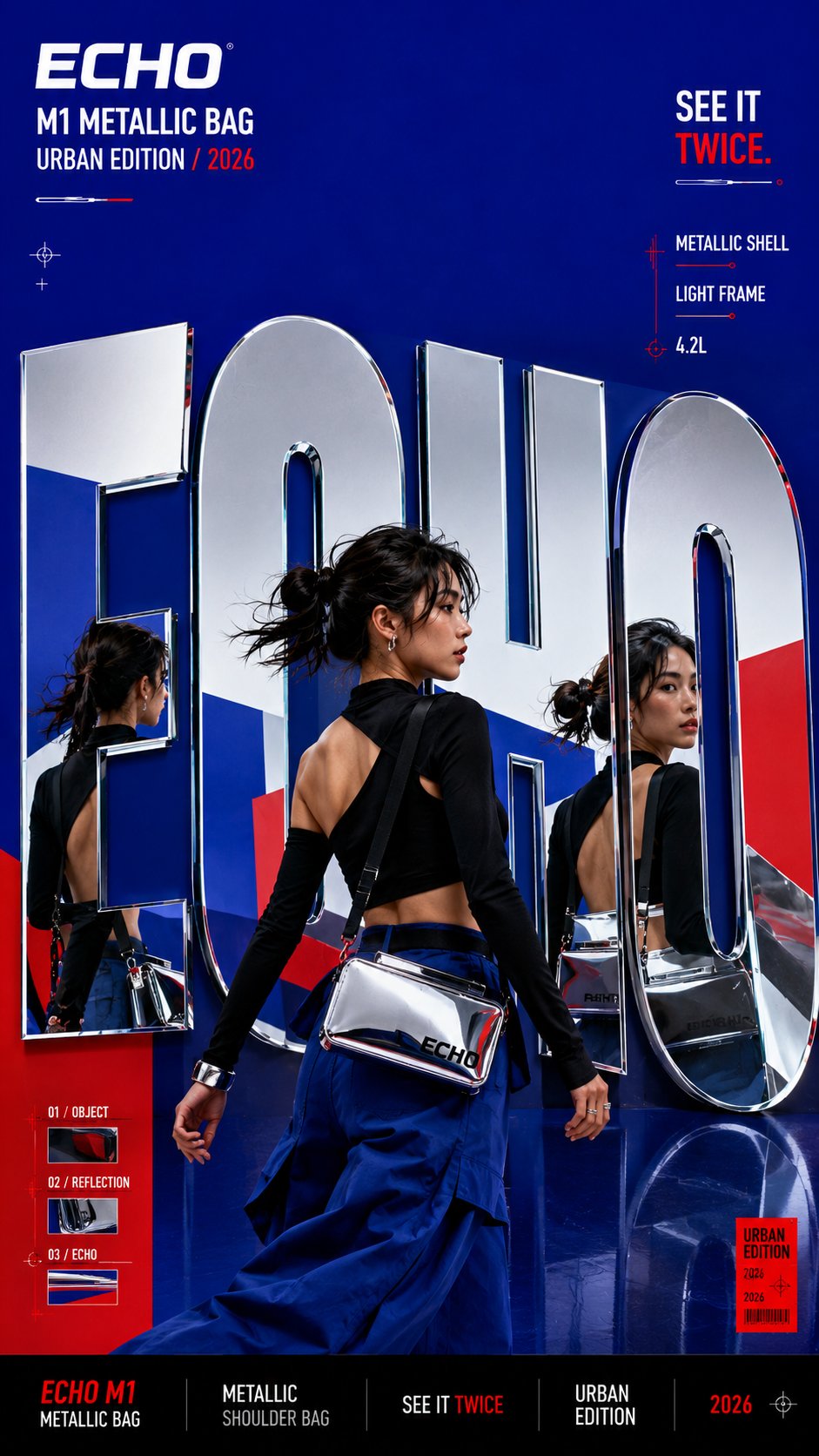
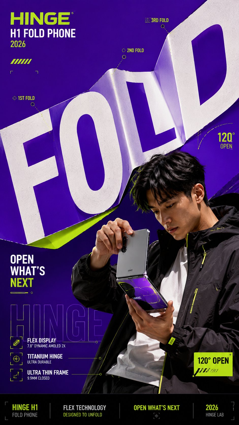
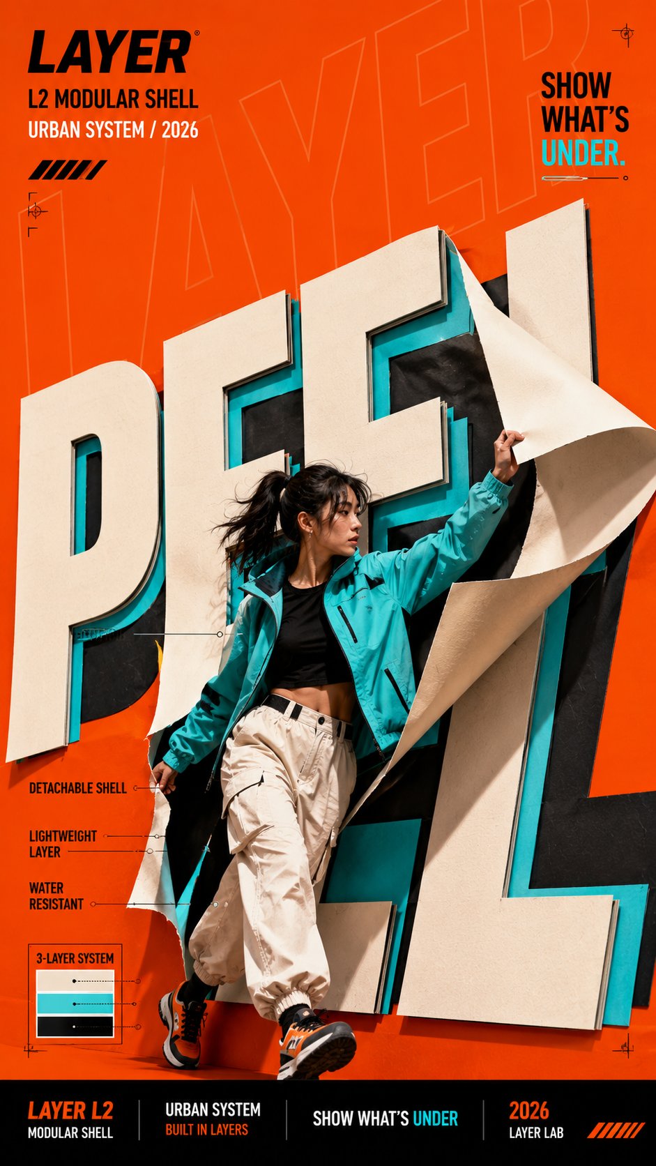
发布者:RadishonCreate a bold editorial campaign poster where oversized typography behaves like a physical material instead of remaining flat and static.
Brand: [BRAND NAME]
Product / Campaign: [PRODUCT OR CAMPAIGN]
Main Word: [SHORT WORD]
Subject: [PERSON / PRODUCT / BOTH]
Material Behavior: [FOLD / PEEL / SPLIT / REFLECT / OTHER]
Main Color: [COLOR]
Accent Color: [COLOR]
Campaign Details: [SLOGAN / SPECS / DATE]
Aspect Ratio: [9:16]
Use realistic commercial photography, oversized typography, strong high-contrast colors, and contemporary editorial design.
Make the main word extremely large, filling roughly 50–75% of the composition. Let the typography physically react according to the selected material behavior:
FOLD: create clean creases and folded planes that follow the product or subject's structural direction.
PEEL: build several clean color layers and let the top layer lift away to reveal what is underneath.
SPLIT: divide the typography into several large strips and shift them in alternating directions while keeping the subject visually intact.
REFLECT: turn the letterforms into flat mirrored surfaces that realistically reflect the subject, product, and surrounding colors.
Create strong foreground–subject–background interaction so the person or product feels physically connected to the typography.
Use one dominant color with black, white, and one contrasting accent color. Add only a few meaningful campaign details such as the brand name, product name, slogan, specifications, or small editorial labels.
Keep people, products, materials, lighting, and reflections realistic and polished.
The final image should feel like a finished campaign key visual — bold, colorful, layered, and conceptually clear.
Avoid generic subject + big text layouts, random deformation, heavy 3D lettering, meaningless filler text, excessive UI graphics, clutter, and disconnected visual effects.