1 / 1
食物×排版创意互动海报
MMrLarus原创
发布者:Radishon[BRAND]: {brand name}
[FOOD / DRINK]: {main product}
[HEADLINE]: {main word or short title}
[INTERACTION]: {weave through type / refract type / create negative space / replace a letter}
[ACCENT COLOR]: {main typography color}
[DETAILS]: {ingredients / short copy / hours / address}
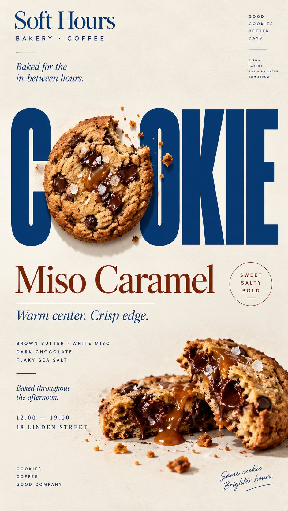
Create a 9:16 vertical food editorial poster combining highly realistic food photography with bold, expressive typography.
Use a warm cream or ivory paper background with subtle natural texture. Keep the food or drink realistic, appetizing and materially believable, with natural highlights, shadows, texture and proportions. Avoid CGI, plastic surfaces, floating cutouts or overly polished commercial rendering.
The key concept is that the food must physically interact with the typography according to [INTERACTION], rather than simply sitting beside the text.
For "weave through type," let a few continuous food elements move naturally in front of and behind large letters with clear, believable depth.
For "refract type," place transparent glass or liquid in front of the headline so only the letters seen through it are naturally shifted, enlarged or distorted by real optical refraction.
For "create negative space," let the shape or missing portion of the food create a clean empty area where the headline naturally fits.
For "replace a letter," use the food itself as one recognizable letter inside the headline while keeping the full word immediately readable.
Make [HEADLINE] one of the strongest visual elements using bold editorial typography. Integrate type and food into the same composition with clear hierarchy, strong negative space and intentional cropping.
Add only a few useful brand details such as [BRAND], ingredients, flavor notes, opening hours or address. Keep all copy short and meaningful.
Use [ACCENT COLOR] as the main typographic accent alongside cream, natural food colors and dark neutrals. Keep the palette controlled.
Avoid numbered labels, 01/02, Vol., sparkles, generic filler copy, unnecessary decoration, UI-style cards or template-like layouts.
The final poster should feel like a real café, bakery or restaurant campaign: visually striking at thumbnail size, detailed up close, and built around one clear idea where food and typography genuinely affect each other.
[BRAND]: {品牌名}
[FOOD / DRINK]: {主产品}
[HEADLINE]: {主文字或短标题}
[INTERACTION]: {穿插于字体间 / 折射字体 / 创造负空间 / 替换字母}
[ACCENT COLOR]: {主字体颜色}
[DETAILS]: {食材 / 短文案 / 营业时间 / 地址}
创建一张 9:16 竖版食物编辑海报,融合高度逼真的食物摄影与大胆、富有表现力的字体设计。
采用温暖的米色或象牙色纸张背景,带有细微的自然纹理。保持食物逼真、诱人、材质可信,带有自然的高光、阴影、纹理和比例。避免 CGI、塑料质感、悬浮抠图或过度商业化的精修渲染。
核心概念是食物必须根据 [INTERACTION] 与字体产生真实的物理互动,而非简单并排放置。
对于"穿插于字体间",让一些连贯的食物元素自然地穿梭于大字之间,有清晰可信的前后深度关系。
对于"折射字体",将透明玻璃或液体置于标题前方,使透过它的字母产生自然的位移、放大或光学折射变形。
对于"创造负空间",让食物的形状或缺失部分形成一个干净的空白区域,标题自然嵌入其中。
对于"替换字母",让食物本身成为标题中一个可辨识的字母,同时保持整个单词的即时可读性。
将 [HEADLINE] 作为最强的视觉元素之一,使用粗体编辑字体。整合字体与食物于同一构图中,保持清晰的层级关系、强烈的负空间和刻意的裁剪。
仅添加少数有用的品牌信息,如 [BRAND]、食材、风味描述、营业时间或地址。保持所有文案简短而有意义。
使用 [ACCENT COLOR] 作为主要字体强调色,配合米色、自然食物色调和深色中性色。保持色系统一。
避免数字标签、01/02、Vol.、闪光效果、通用填充文案、不必要的装饰、UI 风格卡片或模板化布局。
最终海报应呈现真实的咖啡馆、面包店或餐厅宣传感:缩略图尺寸下视觉冲击力强,近看细节丰富,围绕一个清晰理念构建,食物与字体真正相互影响。