1 / 2
高端冰淇淋品牌电商详情页销售海报
oou_zhen599原创
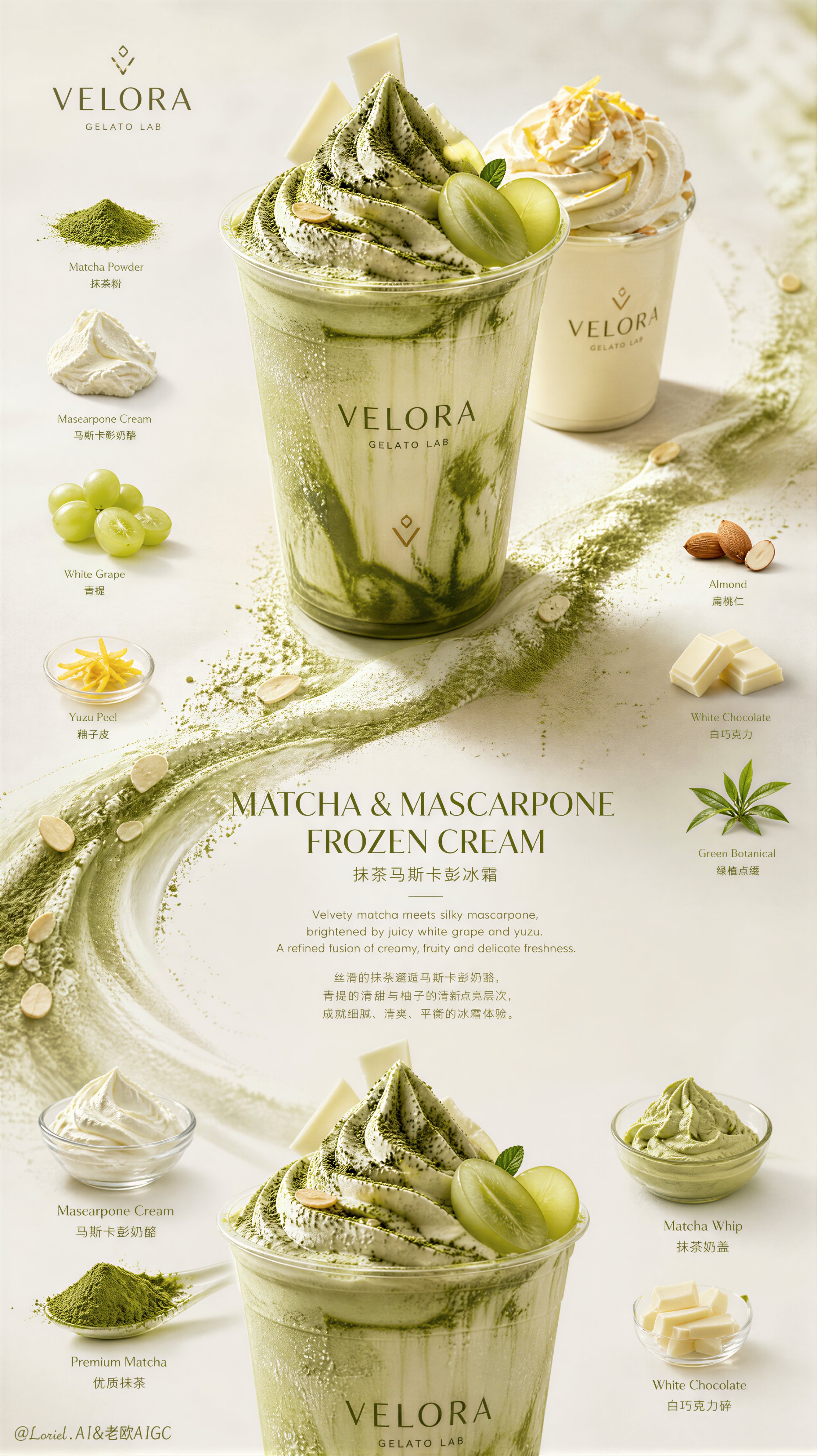
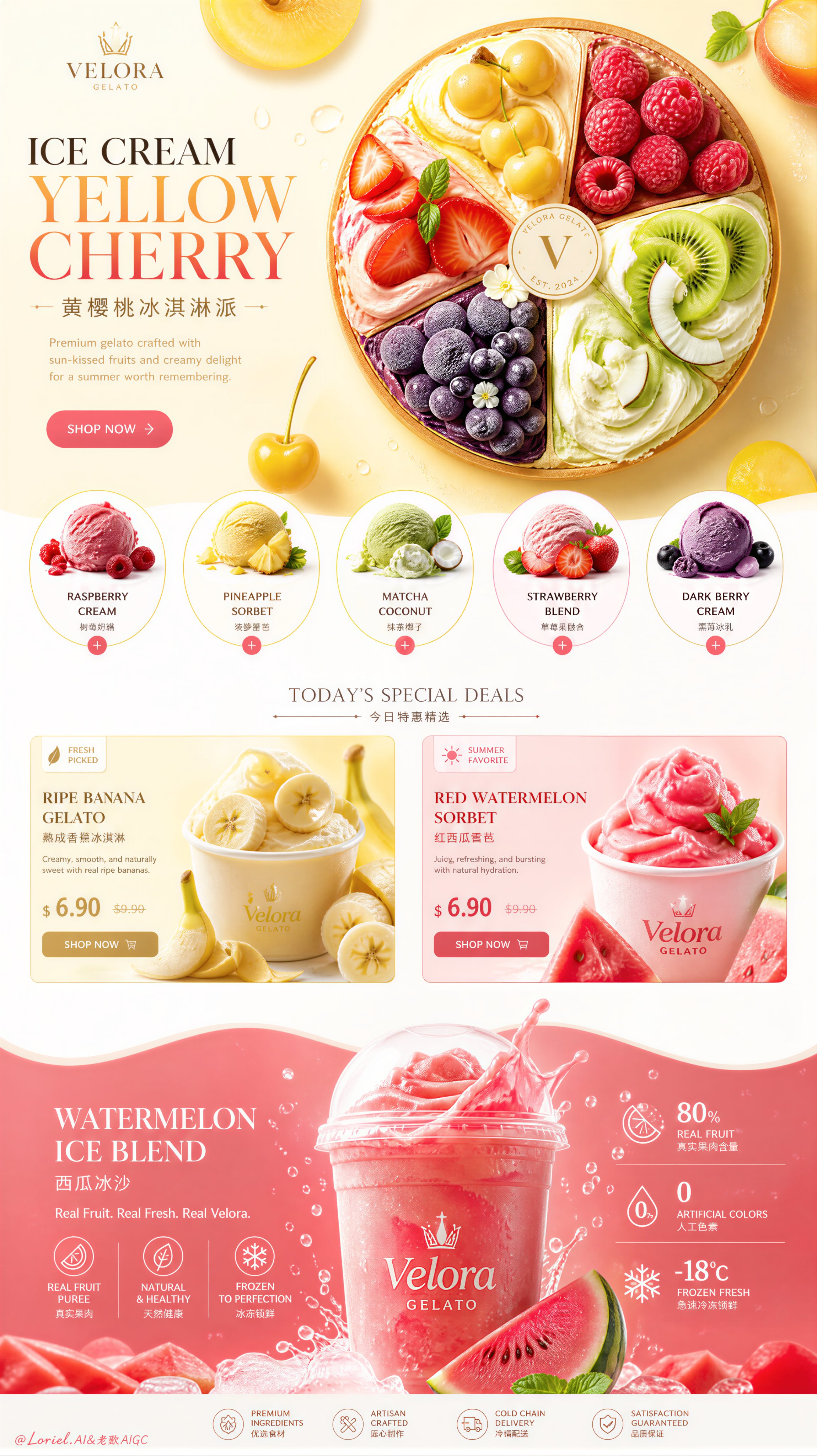
发布者:RadishonCreate an ultra-premium ice cream brand e-commerce detail-page sales poster that merges Cream Halo Transit flagship brand precision with Milk Cloud Orbit tactile frozen-dessert realism, while strictly preserving the exact original single-page vertical homepage-detail structure. Do not change the composition logic. Keep the same bright top hero banner with left-side title/copy/CTA and one large circular frozen dessert composition on the right, the same row of circular flavor cards beneath, the same centered middle "deals" zone with two side-by-side product features, and the same lower wavy color-band section with one dominant fruit-ice beverage hero and supporting stat / ingredient information. The final artwork must feel more like a collector-grade sales key visual than a standard e-commerce page: hyper-real, bright, premium, playful, and internationally polished.
Brand identity:
Create a self-invented premium ice cream company such as "VELORA GELATO", "AUREL FRUIT CREAM", or "MOSA FROST HOUSE". The brand must feel modern, colorful, youthful, luxurious, and commercially elite. Use a minimal official logo mark, elegant English main titles with smaller Chinese subtitle support, and a fully unified flagship visual language.
Strict original structure:
This is critical. Preserve exactly:
1. Bright top hero section with left-side headline/copy/CTA and right-side circular frozen dessert hero.
2. Row of circular flavor / category cards below.
3. Centered middle feature zone with two side-by-side fruit product blocks and UI-like pricing/sale elements.
4. Lower wave-shaped color-band hero section with one dominant fruit ice drink / frozen cream beverage.
5. Decorative floating fruit slices, leaves, and small accents throughout.
Do not redesign into a grid, a different landing page, or an alternative card system.
Collector-grade sales visual upgrade:
This is critical. Make the page feel like a collectible flagship sales visual by:
- reducing visual noise
- enlarging negative space inside all modules
- making each fruit and frozen object more sculptural
- refining CTA, pricing, and micro UI handling
- strengthening the rhythm between the big modules
- letting color blocks, frozen texture, and fruit realism carry more emotional impact
It should still be clearly commercial, but far rarer and more display-worthy.
Cream Halo Transit flagship precision:
Unify the entire page into a stronger international brand system. Hero headline, Chinese subtitle, circular flavor-card text, middle deals-title, pricing logic, CTA buttons, small labels, and bottom stat blocks must all share one disciplined visual language with better spacing, calmer hierarchy, and more premium alignment. The page must feel like one official flagship campaign rather than stacked content sections.
Milk Cloud Orbit frozen realism:
Push tactile realism to the highest level:
- gelato / frozen cream swirl definition
- frost particles and cold condensation
- fruit flesh translucency and juice sheen
- creamy thickness and soft scoop edge logic
- splash realism and frozen-liquid transition
- cup reflections and lid clarity
- fruit peel pores and cut-surface wetness
- sauce or puree gloss and viscosity
Everything must feel touchable, de-AI, collectible, and materially expensive.
Top hero section:
Keep the original left-right structure. On the left, place one bold English title such as "ICE CREAM YELLOW CHERRY" or "FRUIT GELATO SPLIT", one smaller Chinese subtitle, and one refined CTA. On the right, keep one large circular frozen dessert composition resembling a fruit-topped ice cream tart or gelato wheel, divided into colorful premium fruit sections. Make it more sculptural, cleaner, and more collectible.
Flavor-card row:
Preserve the circular flavor-card logic but make it more luxurious. Use several distinct same-series flavors such as raspberry cream, pineapple sorbet, matcha coconut gelato, strawberry fruit blend, and dark berry frozen cream. Keep the cards aligned, bright, and highly controlled, with stronger contrast but less visual clutter.
Middle feature zone:
Keep the original central "deals" logic with two side-by-side fruit-centered product stories such as ripe bananas and red watermelon. Refine the UI elements, sale tags, and price blocks so they feel premium rather than promotional-heavy. Let the fruit and frozen product visuals dominate.
Bottom hero section:
Preserve the wavy saturated lower section with one dominant fruit ice beverage / frozen cream hero. Make the drink more collectible and materially rich: deeper frozen texture, more elegant splash, finer condensation, and more refined ingredient side visuals. Keep the lower stats and info blocks but unify them into a more premium flagship rhythm.
Color direction:
Use a refined but lively palette of saturated yellow, cherry red, watermelon pink, citrus orange, kiwi green, cream white, blueberry violet, and mint leaf green. Keep the color blocks bold but more mature, more controlled, and more expensive.
Lighting:
Use high-end commercial dessert lighting with crisp fresh highlights, elegant shadow falloff, refined reflections on frozen surfaces and fruit, and beautiful realism throughout. The page must feel luminous, joyful, premium, and collectible.
Rendering style:
ultra-premium ice cream e-commerce detail page, strict original single-page vertical structure, Cream Halo Transit flagship brand precision, Milk Cloud Orbit tactile frozen realism, collector-grade sales key visual, bright hero banner with circular fruit frozen dessert composition, circular flavor-card row, centered deals zone, lower wavy fruit-ice drink hero section, elegant English main titles with smaller Chinese subtitles, award-winning commercial design, 8k, masterpiece quality
Negative prompt:
changed page structure, homepage redesign, random card layout, cheap dessert ad, fake cream texture, plastic fruit, cluttered page, messy typography, generic template, low-end packaging, oversaturated chaos, harsh flash lighting, noisy props, cartoon rendering