1 / 4
旅行印章日记对比海报
aai_suxiaole原创
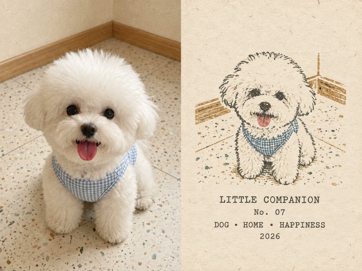
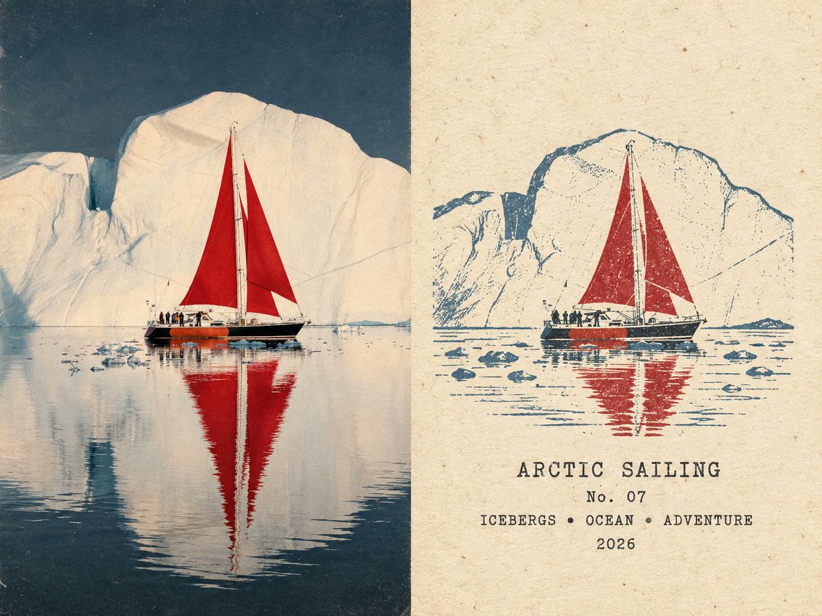
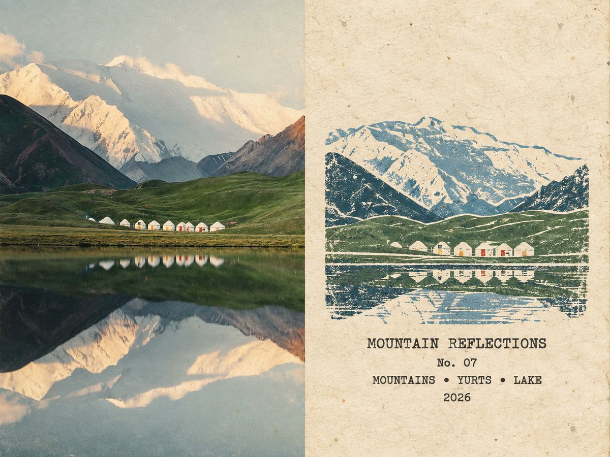
发布者:RadishonCreate one independent 4:3 landscape "rubber-stamp travel journal comparison poster" from each uploaded photograph. If multiple photos are uploaded, process them separately and never combine them.
Optional user metadata:
Theme or title: [blank = auto-generate]
Number: [blank = auto-generate]
Year: 2026
Divide the canvas vertically at the exact midpoint: 50% original photograph on the left and 50% aged-paper stamp design on the right. Do not add a visible divider, border, gutter, overlap, or before/after labels.
LEFT SIDE
Fill the left half with the uploaded photograph. Preserve all people, animals, objects, architecture, scenery, poses, identities, spatial relationships, perspective, lighting, and recognizable details. Crop proportionally only when necessary; never stretch, mirror, redraw, move, replace, or invent subjects.
Match the reference-material finish with restrained vintage editorial grading: slightly faded colors, gently reduced contrast and saturation, subtle warm aging, fine film grain, faint paper fibers, and a matte archival-print texture. Keep the image clearly photographic and do not obscure important details.
RIGHT SIDE
Use warm off-white handmade paper with subtle beige variation, visible natural fibers, tiny flecks, light aging, and a matte tactile surface. Preserve generous blank space.
Place one compact multi-color rubber-stamp illustration in the middle-to-lower area, with a small archival text block below it. The stamp should occupy about 65%–78% of the right panel's width and 25%–38% of its height. Do not turn it into a full-page illustration, logo, circular seal, postage stamp, or decorative badge.
Analyze the source photo and retain only the minimum visual information needed to recognize the same subject and scene: the dominant silhouette, key landmark or subject, major foreground/background relationship, horizon or ground line, and a few essential secondary elements. Preserve the exact subject count, pose, orientation, recognizable structure, and left-to-right relationship. Remove crowds, repetitive windows, dense vegetation, minor objects, photographic shading, and irrelevant details.
For architecture, preserve its defining silhouette, arches, dome, roof, tower, or facade rhythm. For landscapes, preserve the major mountain, shoreline, water, road, tree, or horizon contours. For people and animals, preserve their number, pose, clothing or costume, distinctive shapes, and relationships. For vehicles or objects, preserve the recognizable silhouette, orientation, primary color placement, and scene relationship.
Render the right-side image as a real hand-carved rubber-stamp print: irregular engraved contours, uneven line weight, broken edges, dry-ink gaps, granular pigment, sparse hatching, partial fading, paper bleed-through, uneven pressure, slight double impressions, and subtle 1–2 mm color misregistration. It must look physically stamped onto fibrous paper, not like a photo filter, clean vector graphic, watercolor, pencil drawing, cartoon, or digital illustration.
Extract 2–4 muted spot colors from the original photo. Use one dark structural ink plus one or two scene-specific colors and, only when useful, one small accent color. Suitable tones include charcoal, deep green, slate blue, brick red, ochre, muted mustard, faded olive, or gray-brown. Use flat ink layers without smooth gradients or oversaturation.
TEXT
Place four restrained lines below the stamp:
[THEME OR LOCATION TITLE]
No. [NUMBER]
[KEYWORD 1] • [KEYWORD 2] • [KEYWORD 3]
[YEAR]
If the user provides a title, number, or year, reproduce it exactly and generate only the missing fields. If the title is blank, use a reliably recognizable English location name; if the location is uncertain, generate a concise 1–3 word descriptive English title without guessing a real place. If the number is blank, generate one two-digit number from 01–99. If the year is blank, use a reliable visible year or the current Gregorian year. Automatically generate exactly three short uppercase English keywords from the image.
Use small dark-charcoal, typewriter-style typography with slightly imperfect mechanical ink. Keep every word correctly spelled and fully legible. Do not add slogans, logos, signatures, coordinates, social-media handles, pseudo-text, or watermarks.
The final result must feel like a quiet, collectible field-journal spread: the left side documents the real scene, while the right side preserves its most recognizable visual memory as a small handmade rubber stamp. Return only the finished poster.